Friday, 22 March 2013

Production: Contents Page Initially and Changes Made


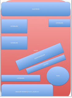
On the right, was my finished first draft of my contents page product. I am at a stage now where I am reflecting over each text and making big improvements. 
The most significant alteration I have made to the contents page is the main focus image. Despite liking the initial image because of the eye contact with the artists and my camera, it occurred to me that the image quality was not good enough for such a big part of the page. Therefore, I replaced the image with the one on the right which is of a much better resolution. It also features the colour red more and so goes with the page's colour scheme nicely. 
To make sure this still fit with my over all product, I made sure to add in a cover line that referred to this image on the front page, to create synergy. (This is along the top banner, which I have added on to the front cover text. I will make a post about these changes soon). I also changed the cover line in this section 'Best moments 2012' to 'Best Events 2012' because I had changed the words on the cover as well for spacing purposes. Because I changed these two type factors, I unfortunately had to change the font used in this part of the page because the ones I had used were no longer available. 
For the new font, I used 'Dafont.com' again, and used the font '28 days later.' I thought this font alteration would be a negative change to the page, as the first fonts used are also used across the page which creates a neat and authentic look. However, I believe the new font choice goes well with the rest of the page, I have used san serif font frequently and this font is an example of this as well, therefore it does not standout too much as different, so it wasn't that bad of a change. I have been using san serif font frequently in my texts, this was a feature I picked up in my magazine analyses and think it adds professionalism to the pieces. 

    Another thing that I changed was plug on the top half of the page that indicated the 'cover story,' but I still featured the other ones on the bottom of the page. This was because I felt that there was too many of these on the page, and against the 'redness' in the photo the colours were too overwhelming and they didn't stand out. Furthermore, because I had changed the band featured in the image, and this cover line was also on the front page, that meant I would have had to add another one to that section of the page (next to 'Bowling For Soup'). I felt that I was in a position to get rid of these two plugs, because the two cover lines had a bigger portion of space on the page, and were also given red star shapes behind their page numbers that look like the plugs that I use. Therefore, it can be said that it's unnecessary to label these cover lines as ones that were featured on the cover, as because they have a significant amount of space it's indicated they are of importance, and because they are important cover lines it is likely that they would have been featured on the cover anyway.

Another change that I made was on the actual contents of the page, I added more features to the magazine as I felt there was too much negative space. Some of the content added was 'MCR reunion!' (Spelt incorrectly, this is not the final product!), '30STM film?,''Your local battle of the bands 2013' and some more band titles in the 'gig section.' I also made all the text in this section bolder, as I felt it needed to stand out more. I changed round some of the plugs and made them smaller, and may change them around again as I am not sure that this is the best position choice for them at the minute. I also added a picture on the far right of one of the bands I had listed that will be playing live soon (in the 'gig' section). I made sure that this picture was one of them playing live as it would go well with the context in which the band is mentioned, I liked this picture as it has a lot of blue, which contrasts my picture of 'Felicity State' well, which is purple. Originally I had these pictures slanted, but putting them upright I felt looked more professional and neat. Furthermore, I moved the line shapes dividing the page, and measured properly the length in which to place them so that they were even.

Wednesday, 20 March 2013

Production: Cover Page Draft

This is a screen grab from the production of my front cover page. At this point in the creation, I had fully edited the colour and contrast the fundamental main image, and had now added the masthead, some cover-lines and more images.

The masthead was created using a font creater website, I wrote my magazine's name: 'CLASH' into the font generator, then I print screened the outcome, in order to import the image onto my media text. This came with some complications, as originally the design had a white background and black text. I had decided I wanted to reverse this colour scheme, as I felt this way was more visually pleasing and also this worked to my advantage when comparing the text with my model. This was because I decided to keep the two images blocked, and not merge the model over the text (contrary to this convention of magazine cover pages) as my models hand would have covered too much of the text and her black hair against black text would have made the masthead less eye catching. I also like the fact I kept the blocked imagery, it creates a parallel with the main images colour scheme on white on black and devides the page up to make it look more interesting.

Here are examples of the magazine 'Kerrang' that has also used their masthead blocked:


The cover lines I had included at this point where the some in to a tour and the main cover line relating to my magazine's main feature. For the main feature cover line I used colours red and white, and used three different 'sections' to the text, coded by colour. The red 'section' was placed in the middle to highlight the point of the feature, which is the band 'Deadrunners.' Then, because my feature is an interview with one of the band members I included a quote in the first 'white section' which I placed above the 'red,' reading 'I get crazy when I'm on stage.' Using a quote from the interview will intrigue readers to want to read more and purchase the magazine. Then lastly, in the second 'white section' reads 'Felicity State's wild side' this confirms that the interview will be with a singular member of the band, and also expands on the first 'white section' of the cover line that tells us the musician becomes passionate (or 'wild') on stage. I also added a black border to every font used on my cover lines, mostly black, to make them stand out more. This also reinforces one of the fundamental colour themes I chose. For the main cover lines and the main 'sections' of the other cover lines (the band's name) I also used fonts from the font generator in order for them to grab the viewers attention. Using a variety of colours also contributed to this.

In relation to the added images, I decided to add some of the photographs I have taken at festivals to feature as posters for the readers to rip out of the magazine and use on their walls. Free posters is the most frequent free gift featured in rock merchandise, along with sample EP's and records. I felt this was something that made CLASH a little more authentic, and relates directly to the target audience as it is known that teenagers like to hang posters on their walls. I did this by importing the images and then adding the black border in order for them to look consistent with the visual themes of the rest of the page. Another image I had imported onto the page was the bar-code on the bottom right, this was to add further authenticity, along with the magazines date issue and price.

When I complete my first draft, I will post a full step by step creation process for my front cover, as I have been frequently screen grabbing the outcomes.

Friday, 15 March 2013

Production: Contents Pages Drafts


These are screen shots taken of my contents page whilst I was creating them, here I have imported the main image and added multiple cover lines along with feature listings, all conventions of a typical contents page. I decided to do all of this manually in order to achieve my chosen ratios, proportions and placing. I created three columns at the lower half of the page and listed my chosen contents. I listed only highlights of the magazine, not full chronological listing of the content, this way I could enc-operate a lot of the cover lines featured on my cover page. I also manually created a sticker that highlighted the stories that were shown on the front cover to make this clear for the readers, it was created from a red jaggered circle that I added a thick outline to and wrote 'cover story' in the same font that is shown on 'contents' and on the cover's masthead. This was one of the many factors I chose to make sure the magazine contents page looked consistent with the rest of the texts, another way I did this was to keep the colour scheme frequent, and use pictures of the model on the cover to highlight the magazines main feature. Furthermore, I have used a main image along with two cover lines in bigger font, this was enforce the some of the 'best features'. For example, the magazine will include smaller stories, such as weakly additions and information of smaller bands, there will also be slightly more valuable and enticing stories that correspond with current tours, dates, and record releases and then there will be the most intriguing stories that are the main selling points to the magazine. This will be interviews, photo shoots and stories that consist of rare happenings, and feature artists that are the most popular at the time. For example, I chose 'Best moments of 2012' as a bigger cover line due to it being an infrequent story to feature. Another significant story is the interview mentioned with band Tenacious D, which to enforce I have displayed a large picture of the band along with a large font on the matching cover line. And finally, the other 'main' story is the interview with my fictional band Deadrunners, which has been shown to be of importance through their spot on the main page, and further pictures featured on the contents page along with their 'cover story' sticker.

Saturday, 2 March 2013

Production: Chosen Photographs


Cover                                 Double Page Spread                                Contents


These are my chosen images for the cover, contents pages and double page spread which were all taken by myself. I thought the picture for the cover looked very eye catching with the use of eye contact, pose and facial expression. It stood out the most too me so I thought it would be suitable for the cover, to attract readers. Further more this image is an example of the rule of thirds, this is also the case for the double page spread image. I thought this was a relevant image to use because despite the back ground being different, it is still obvious that the character is the same due to the styling, clothes and pose. Lastly I chose this specific picture for the contents page because I thought it would be useful to incorporate a legitimate band into my magazine to enable it looks realistic and also to ensure I would appeal to the correct chosen audience. This is a photo of the band Tenacious D that I took when I saw them live, they are looking directly at the camera and so I thought this photo was suitable to use on my contents page. I will not crop a lot of the picture as I think having it landscape will look good against the rest of my contents page.


Thursday, 14 February 2013

Production: Photoshoot

_1110522_1110521_1110520_1110519_1110518.
_1110517_1110516_1110515._1110514.
_1110513_1110512_1110511_1110510_1110509_1110508
_1110507_1110506_1110505_1110504_1110503.
 This is my photography for CLASH, I used my friend Man Yee because I thought she could fit into the persona of a Rock artist well, with her long dark hair and pale skin tone, which fits into my genre and will also complement my colour scheme well. When directing her modelling, I encouraged her to impersonate an 'aggressive' style in order for the pictures to be suitable for my chosen genre of Rock/Metal music. This is how we achieved shots of her looking superior and of an authoritative position, a classic convention of featured models in most magazines. There are also shots of Man Yee screaming and pulling uncomfortable faces, I thought these worked well in my genre in an effort to communicate themes of distortion and destruction that conforms to the stereotypes evident in Rock music. Examples of this style of modelling came in my post about photography, which also inspired me to direct Man Yee to make 'smirking faces' as when writing that blog post and researching existing photography of females in this genre, I thought those types of facial expression were strong.
      I also styled her hair, dressed her and coordinated her make up. I chose dark colours, to go with her hair and embody a suitable image for the genre. The most significant element of her makeup was the black lipstick that I chose, this went well with the colours of the shoot and Man Yee wore it well, as the combination of the colour and her hair complemented the over all images. Black lipstick holds connotations of darkness, rebellion and rock music and was a theme I enjoyed when researching female photography. For accessories, I wanted to further communicate connotations of my genre. I chose a headband (that we also used as a necklace) and a bracelet that had metalic spikes on them. These items connotate themes of Rock and Roll as they are sharp and convey a certain edge/style that just reminds you of rock/punk stereotypes. I also knew I wanted to have either a white or red back ground, and so the black contrasts well with this, creating a pleasant and existing visual, that will contribute and influence my colour schemes.

Wednesday, 6 February 2013

Planning: Flat Plans


These are flat plans for my front cover, contents page and double page spread. They will help me to start designing my pieces of media by having a rough visual in mind before starting.