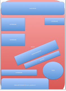
These are flat plans for my front cover, contents page and double page spread. They will help me to start designing my pieces of media by having a rough visual in mind before starting.
Wednesday, 6 February 2013
Planning: Flat Plans
These are flat plans for my front cover, contents page and double page spread. They will help me to start designing my pieces of media by having a rough visual in mind before starting.
Thursday, 31 January 2013
Planning: Proposal
I have chosen to create a music magazine about rock music with the core target audience of people in the age range of 15 - 25, and of either gender. My research has made me understand that this range of age will differ as this genre appeals to a large group of individuals with diverse traits and characteristics, but the age I have specified will be where the majority of the readership will come from. This is based from the statistics I have looked at concerning products that target the same audience/will be of similar content to my own texts. I will try to relate and attract this audience by using similar qualities that follow the rock stereo type and what I believe will interest them, such as color schemes, fonts, cover lines and free gifts.
For the masthead i had the initial idea to use a single word that reminds the reader of destruction or the sound of rock music. This is used in rock magazines around today such as 'Kerrang,' which uses onomatopoeia, as it was created to sound like the strum of an electric guitar. This same technique is used throughout multiple texts associated with this genre, such as 'Scuzz,' a rock and heavy metal music channel, again trying to imitate the sounds of amps or quitars. Destruction is also conveyed in music media titles such as 'Metal Hammer,' these words hold connotations of violence and something that is heavy (this is clever, as Metal Hammer is a magazine that conforms to the Heavy Metal Rock sub genre)
The ideas I have thought of for my magazine title are: CLASH, SMASH and ZWANG, these all use this effective technique of phonology for audience attraction whilst further conveying the 'feel' of Rock with violence. Either of the three will allow the reader to recognize the text's genre because of the technique being a common convention used in different texts. I also like these three examples because they are only one word long, this will give the magazine a nice edge.
Font ideas:
Depending on my picture outcomes, I may reverse the fonts to white on black, or change the colours completely. But I'll decide that later on in the project.
Cover line ideas:
Download festival exclusive - This is a well known British festival, that is famous for being a Heavy Metal event. However Rock, Punk and Dance artists also perform there. This will appeal to my audience as it covers all the genres of music that my magazine does.
Free EP of new band Deadrunners! - A free gift will attract readers and also having the free item come from a new band will promote the band and entregue customers. However, I may not use this coverline as I want to use my fictional band 'Deadrunners' for the main cover line and perhaps double page spread. Having the same band featured in two different cover line may seem unrealistic.
30 Seconds To Mars on their new tour - This will also entregue readers as using the word 'new' implies obviously that this isn't past news and will make the subconscious mind feel anxious to read about it.
Enter Shikari new album? - This does the same effect but differs the cover lines so there is variety
This year's top ten gigs - This cover line shows that there will be gig dates in the magazine and there will be advise on which ones to go too.
Besides from the photos I take for my cover of my friend, I will use photos that I have taken in the past when i have attended gigs and music festivals. This will allow the magazine pages to look authentic, and I can refer to actual bands that connect with my genre as well as showing visuals of them.
This issue of the magazine will be early January so i can mention features about the new year and upcoming gig dates. This can also be an opportunity to reflect on actions of the previous year, with concert ratings, 'best moments', photos and story's.
The majority of my magazine will be about well known bands, I will advertise gig dates, reviews, albums, singles, tours and social news all to do with artists who produce music that is associated with the Rock genre. I have decided that the artist on the cover will be from a band that I have made up called 'Deadrunners,' they will be a hard rock band. I will take their sub genre into consideration when styling my model, as from my photography research I have learnt that it is a key element in creating front covers to make sure the artists featured communicate the style of music they produce, and then also portraying traits from the magazine's genre of music too. Aside from music, I could include vouchers and advertisements for websites that sell clothing and band merchandise that are in the same genre as my magazine. Furthermore there could some small features or columnists that review new films, or write about up coming social events such as meet and greets and signings. This will be beneficial as my target audience will be interested in other youth related things being in the age range of 15-25.
The price of the magazine will be £1.75, the page maximum will be 50, and it will be released every two weeks. Initially I thought I would produce it monthly, but after further deciding to make my magazine relatively cheap as a marketing advantage, this would mean that producing the magazine wouldn't be too complicated. Therefore, releasing it monthly would be unnecessary and may even cause loss.
For the masthead i had the initial idea to use a single word that reminds the reader of destruction or the sound of rock music. This is used in rock magazines around today such as 'Kerrang,' which uses onomatopoeia, as it was created to sound like the strum of an electric guitar. This same technique is used throughout multiple texts associated with this genre, such as 'Scuzz,' a rock and heavy metal music channel, again trying to imitate the sounds of amps or quitars. Destruction is also conveyed in music media titles such as 'Metal Hammer,' these words hold connotations of violence and something that is heavy (this is clever, as Metal Hammer is a magazine that conforms to the Heavy Metal Rock sub genre)
The ideas I have thought of for my magazine title are: CLASH, SMASH and ZWANG, these all use this effective technique of phonology for audience attraction whilst further conveying the 'feel' of Rock with violence. Either of the three will allow the reader to recognize the text's genre because of the technique being a common convention used in different texts. I also like these three examples because they are only one word long, this will give the magazine a nice edge.
Font ideas:
Depending on my picture outcomes, I may reverse the fonts to white on black, or change the colours completely. But I'll decide that later on in the project.
Cover line ideas:
Download festival exclusive - This is a well known British festival, that is famous for being a Heavy Metal event. However Rock, Punk and Dance artists also perform there. This will appeal to my audience as it covers all the genres of music that my magazine does.
Free EP of new band Deadrunners! - A free gift will attract readers and also having the free item come from a new band will promote the band and entregue customers. However, I may not use this coverline as I want to use my fictional band 'Deadrunners' for the main cover line and perhaps double page spread. Having the same band featured in two different cover line may seem unrealistic.
30 Seconds To Mars on their new tour - This will also entregue readers as using the word 'new' implies obviously that this isn't past news and will make the subconscious mind feel anxious to read about it.
Enter Shikari new album? - This does the same effect but differs the cover lines so there is variety
This year's top ten gigs - This cover line shows that there will be gig dates in the magazine and there will be advise on which ones to go too.
Besides from the photos I take for my cover of my friend, I will use photos that I have taken in the past when i have attended gigs and music festivals. This will allow the magazine pages to look authentic, and I can refer to actual bands that connect with my genre as well as showing visuals of them.
This issue of the magazine will be early January so i can mention features about the new year and upcoming gig dates. This can also be an opportunity to reflect on actions of the previous year, with concert ratings, 'best moments', photos and story's.
The majority of my magazine will be about well known bands, I will advertise gig dates, reviews, albums, singles, tours and social news all to do with artists who produce music that is associated with the Rock genre. I have decided that the artist on the cover will be from a band that I have made up called 'Deadrunners,' they will be a hard rock band. I will take their sub genre into consideration when styling my model, as from my photography research I have learnt that it is a key element in creating front covers to make sure the artists featured communicate the style of music they produce, and then also portraying traits from the magazine's genre of music too. Aside from music, I could include vouchers and advertisements for websites that sell clothing and band merchandise that are in the same genre as my magazine. Furthermore there could some small features or columnists that review new films, or write about up coming social events such as meet and greets and signings. This will be beneficial as my target audience will be interested in other youth related things being in the age range of 15-25.
The price of the magazine will be £1.75, the page maximum will be 50, and it will be released every two weeks. Initially I thought I would produce it monthly, but after further deciding to make my magazine relatively cheap as a marketing advantage, this would mean that producing the magazine wouldn't be too complicated. Therefore, releasing it monthly would be unnecessary and may even cause loss.
Monday, 28 January 2013
Research Evaluation
After researching the current music magazine market, and choosing my genre of rock, and further researching this, I have found a number of themes, traits and ideas to include in my text. For example, it's been clear to me after my research that the rock genre is heavily associated with violence and disorder, which will be a theme that can be easily communicated through my graphological and phonological (masthead title especially) choices. This ideology has been expressed through legitimate products with the genre of rock music too, so is obviously a trait others have picked up on and think is useful to use. Furthermore, I have discovered and illustrated how the genre is extremely broad, being an umbrella to multiple sub genres. This will be a feature that must influence my choices in the magazine construction, as the bands featured should be a large variety to satisfy a large audience spectrum of preference.
Friday, 25 January 2013
Research/Planning: Why Did I Choose This Genre?
I have decided to make a music magazine that focuses on the genre of Rock music, I understand this genre on a personal level and am very interested in it. I believe it's fascinating how this genre has been so influential in politics, fashion and art and so think that these interests that I invest personally into the project will benefit my outcomes.
Why is this appropriate?
I have decided to market a product similar to Kerrang! as I believe it is the only product on the market available for it's target audience. By this, I mean Kerrang! covers Rock as a broad genre, including multiple sub genres, where as say Q also covers pop music and associates itself with mostly alternative rock, and Metal Hammer communicates directly with the other end of the spectrum with heavier sub genres such as metal and 'screamo' bands. Therefore, producing another product that corresponds with Kerrang!s intentions would be an appropriate decision, as it will give the common target audience more choice when buying a music magazine that they are interested in.
This could be a rival magazine, and as Kerrang! sells conventionally at £2.20 I will make my music product cheaper, at under £2.00. This will be achievable by making sure my magazine does not have too many pages, and so will be cheaper to produce and therefore distribute. Kerrang! conventionally has around 63 pages per issue, so I'll keep this in mind when planning my magazine further.
The audiences interested in rock music need more media text choices in the industry, as rock is a minority genre of popularity it has limited products dedicated to them. It's obvious that popular mainstream music is the most commonly listened too, proof here with the top ten downloaded singles from 2013, which are all from the pop genre:

Because rock is a minority in the music industry, it does seem appropriate to also have a minority of products produced especially for them. However, because we have established how broad and diverse the genre has proven to be in relation to the multiple sub genres it has created, it can be argued that we do in fact need more material on the music magazine market to satisfy the corresponding wide spectrum of interested buyers.
Why is this appropriate?
I have decided to market a product similar to Kerrang! as I believe it is the only product on the market available for it's target audience. By this, I mean Kerrang! covers Rock as a broad genre, including multiple sub genres, where as say Q also covers pop music and associates itself with mostly alternative rock, and Metal Hammer communicates directly with the other end of the spectrum with heavier sub genres such as metal and 'screamo' bands. Therefore, producing another product that corresponds with Kerrang!s intentions would be an appropriate decision, as it will give the common target audience more choice when buying a music magazine that they are interested in.
This could be a rival magazine, and as Kerrang! sells conventionally at £2.20 I will make my music product cheaper, at under £2.00. This will be achievable by making sure my magazine does not have too many pages, and so will be cheaper to produce and therefore distribute. Kerrang! conventionally has around 63 pages per issue, so I'll keep this in mind when planning my magazine further.
The audiences interested in rock music need more media text choices in the industry, as rock is a minority genre of popularity it has limited products dedicated to them. It's obvious that popular mainstream music is the most commonly listened too, proof here with the top ten downloaded singles from 2013, which are all from the pop genre:

Thursday, 17 January 2013
Research/Planning: Photography Ideas

-Using a female model-
I have decided that I will use a female artist for my front cover. This is because I feel one of my friends will be able to suit the genre nicely, also females have been used on Rock/Metal magazines in the past as the examples apove show. I have looked at these and other examples for inspiration for my photo shoot, and researching this area has been beneficial as I can look at what colours to use, editing styles and make up/clothing. Using a female on my cover is also challenging of the 'rock' magazine stereotype, as the majority of covers do in fact feature male artists. This is because the majority of artists in this genre are male, but I don't think this will make my magazine look any less authentic. In fact I believe it'll make CLASH look unique, whilst still fitting into the Rock/Metal genre stereotype.
- Styling-
Looking at these examples also gave me inspiration for how I will style my model, as most of the photos show a correspondence in apparel, makeup and hair style. In three out of the four photos, the model is wearing black in combination with heavy makeup and big messy hair. The black lipstick in the photo for the magazine 'Metal Edge' appeals to me and I will contemplate including this on my model's style as I think it's very eye catching. The only photo in these examples that stands out from this pattern of dark clothing and make up is the second 'Kerrang' cover (bottom left) as this features a model in bright clothing with well styled hair and pink lipstick, this is a nice challenge of the stereotype conveyed from the other examples. This styling also creates a juxtaposition in colour against the whites, reds and blacks of the cover lines, but I believe the reason for this particular choice of look could be because of the artist's hair colour and reputation in the industry in relation to the music she plays. As we can see the two other artists featured in the other two pictures have black or white blonde hair, which corresponds nicely with the black in their outfits. This model however has ginger hair, and so colours and styles that are used in the picture compliment this look more. In relation to communicating the artist's style of music too, the model from the second 'Kerrang' cover is a member of a pop punk band, where as the two females from the other examples play a genre of rock music that is a little more 'heavy.' This again reinforces how broad and diverse the genre of rock music is.
Examples of this:
(Paramore - Female from bottom left)
Colours and styling in this video also reflect these ideas around the band's genre, things are bright and playful.
(Evanescence - Female from top left and bottom right)
(The Pretty Reckless - Female from top right)
In these two examples the two band's genre of music is again reflected in dark imagery and styling.
These videos reinforce how an artist's music style will be communicated consistently in different media texts through clothing, hair and makeup. Therefore this is an important element to think about when photographing a music artist.
- Positioning and expression -
One thing that adds to the 'fierce' and 'violent' themes in the rock genre that I have expressed is essential in contributing to the genre is the positioning and expression of the models. Despite the model in the second 'Kerrang' cover's styling not communicating these ideas, her posing does as she is 'punching' at the camera. In the Pretty Reckless Kerrang poster the model is pulling a fiece face as she looks directly at the camera with a slight frown, the Metal Edge cover is similar to this however a smirk is added (and this facial expression is again evident in the first Kerrang cover, but with more of a smile). These are all effective ways of communicating the common Rock genre ideoleogies I have discussed, along with making the artist look intriguing.
Tuesday, 15 January 2013
Research: Interview With Members of Target Audience
Target Audience
interviews
Interviewer – What genre of music do you like?
Jake – I like loads of things, but the majority of stuff is
Rock music.
Interviewer – Is there a specific subgenre to this genre you
favour? What types of bands/artists do you like?
Jake – I like both Pop punk and heavy metal, which are
pretty much opposite. I listen to bands mostly and my favourites change loads
so it’s quite subjective, right now I’m really into System Of A Down. I saw
them live in the summer.
Interviewer – Would you be interested in a new music magazine that
focuses on the Rock genre?
Jake – Yeah I guess so, as it’s pretty much my favorite
genre.
Interviewer – What elements in such a magazine would you want?
Jake– Lots of updated information about live music events,
who’s playing, when and where. That’s important.
Interviewer – What colour scheme and design elements would entice
you?
Jake – the front page will have to be really eye catching,
so loud colours. Black also looks really good, it’s classic.
Interviewer – What Genre of music do you like?
Taylor – I like loads of things
Interviewer – What bands/artists are you listening too most at the
moment? Do you have a favourite?
Taylor – I love Blink 182, they’ve been one of my favourite
bands since I was younger. But at the specific moment I’m also into Enter
Shikari, too. And Fall Out Boy! They have a really good new album.
Interviewer - Would you be interested in a new music magazine that
focusses on the Rock genre?
Taylor – Yeah I would, I love reading magazines
Interviewer – What elements would you want it to include?
Taylor – It needs to have pull out posters, they don’t have
to be specifically for this just like good photos that I can rip out and put
up. I love having posters around it’s so cool.
Interviewer – What design qualities and colour schemes would entice
you?
Taylor – A cool front cover image
Friday, 11 January 2013
Subscribe to:
Posts (Atom)


